Green, Gold, Blue and Black: What Colours Mean in Islamic Art

Colour in Islamic art is rarely an accident. Certain colours return across centuries and countries because of what they are linked with: a verse, a building, a material, a place. Knowing those links makes it easier to choose a painting, and to understand why some combinations feel right the moment you see them.
Green
Green is the colour most widely associated with Islam. The Quran describes the people of Paradise wearing green garments of fine silk (Al-Kahf 18:31; Al-Insan 76:21), and Paradise itself is a garden. The dome over the Prophet's ﷺ resting place in Madinah has been green since the nineteenth century. In a home, deep greens feel settled and traditional, especially with gold. Read about the Green Dome in art.
Gold
Gold has been used to honour the written word since the earliest decorated Qurans, where it marks chapter headings, verse endings and sometimes the script itself. It does not tarnish, and it catches light in a way no paint can. On a wall, gold lettering reads as a sign of respect for the words. Our earlier article explains gold leaf in Islamic calligraphy in detail.
Blue
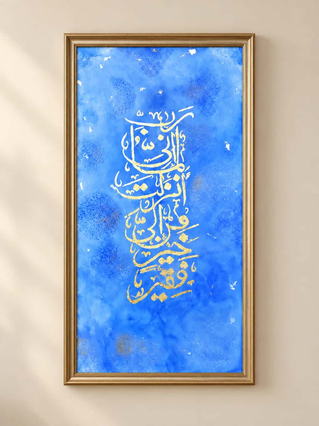
Blue came into Islamic art through precious materials: ground lapis lazuli in manuscript illumination, and cobalt in ceramics. It covers the tiled domes of Central Asia and Iran and the walls of Ottoman mosques. Blue is the colour of sky and water, so it calms a room. It pairs naturally with gold and with white; see the blue and gold Rabbi Inni Lima Anzalta canvas.
Black
Black is the colour of ink, and so of calligraphy itself. It is also the colour of the Kiswah, the covering of the Kaaba, where it is set off by gold and silver thread. Black gives a painting weight and makes every other colour look brighter. Read the story of the Kiswah and how to style black and gold art.
White
White is the colour of the pilgrim's ihram and of the plain page before the pen touches it. In a painting, white space is what lets lettering breathe. Pale backgrounds in ivory, cream and sand have become popular in modern homes because they keep a room light.
Bright, mixed colour
Not every tradition is restrained. Tilework, carpets and painted ceilings from Morocco to South Asia are full of pink, orange, turquoise and violet. Modern calligraphy painters use the same freedom, laying script over bright abstract colour. A piece like this works best as the single strong statement on an otherwise quiet wall.
Choosing colours for a room
- Start with what is already there. Pick one colour from your sofa, rug or curtains and look for it in the painting.
- Decide warm or cool. Gold, red, rust and cream warm a room. Blue, teal, grey and silver cool it.
- Use contrast for readability. Dark lettering on a light ground, or metallic lettering on a dark ground, is easiest to read from a distance.
- Let formal rooms be formal. Black and gold or green and gold suit a drawing room; softer palettes suit bedrooms. The shop by room pages group artwork this way.
- Filter by colour. In the shop you can filter artwork by colour palette to see only what suits your room.
If the right colours do not exist yet, the studio can paint a verse in a palette matched to your room; see the custom artwork process.
Sources
- Quran references: Al-Kahf 18:31 and Al-Insan 76:21, checked against Quran.com.
- Victoria and Albert Museum: Calligraphy in Islamic art.
- The Metropolitan Museum of Art: Early Qur'ans.
Artwork in this article